Learn more here: https://www.elegantthemes.com/blog/theme-releases/responsive-previews
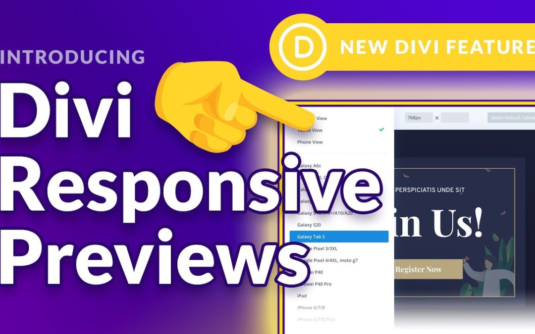
Today we are excited to announce the new and improved responsive preview system for Divi. Now it’s much easier to see how your website will look on different devices and different screen sizes using both portrait and landscape orientations. You can manually adjust the preview size, change your default phone and tablet preview widths and toggle between popular device presets. Using Divi’s responsive editing options, you can adjust your website so that it looks great on all devices.


