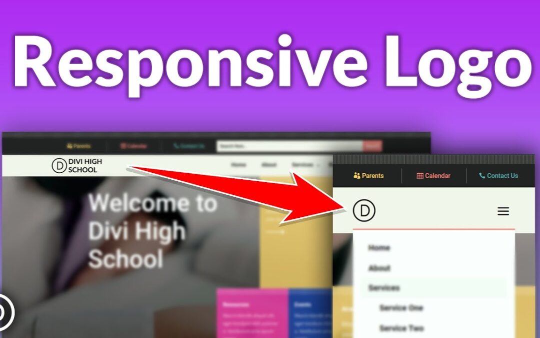
Did you know that over 50 percent of internet traffic comes from mobile devices? That means that the mobile version of your website is extremely important, and may even be the primary way someone will visit your page. Making sure that your website is responsive and mobile-friendly is an essential step in designing a website. In this tutorial, we will show you how to add a responsive logo to your fullwidth menu module using Divi’s built-in responsive options. This will allow you to add a larger or more complex logo that will appear on bigger screens and a smaller or simpler logo that will appear on smaller screens.
Blog post: https://www.elegantthemes.com/blog/divi-resources/how-to-add-a-responsive-logo-to-your-fullwidth-menu-module-in-divi
➡️ Learn more about Divi: https://www.elegantthemes.com/gallery/divi/
🔵 Like us on Facebook: https://www.facebook.com/elegantthemes/
#WordPress #Divi #ElegantThemes


