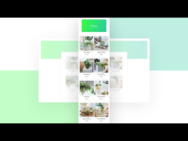
By default, as soon as you switch over to a mobile device, the shop module turns into a one-column layout. Now, if you’re looking to highlight each product individually, that’s great, but with the bigger smartphone screen sizes nowadays, you might want to allow two products to appear next to each other when using the Shop Module.
In today’s Divi tutorial, we’ll show you how to change the shop module’s mobile breakpoint using CSS, allowing two products to appear next to each other on most modern smartphones. This is a great tutorial to have within reach if you’re setting up an online shop in the future! You’ll be able to download the design’s JSON file for free as well!
Read more: https://www.elegantthemes.com/blog/divi-resources/how-to-change-the-divi-shop-modules-mobile-column-breakpoint


